.svg?iar=0&hash=F6049510E33E4E6D8196C26CCC0A64A4)
/hfh-logo-main--white.svg?iar=0&hash=ED491CBFADFB7670FAE94559C98D7798)
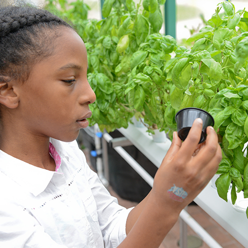
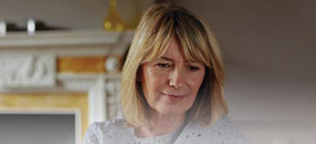
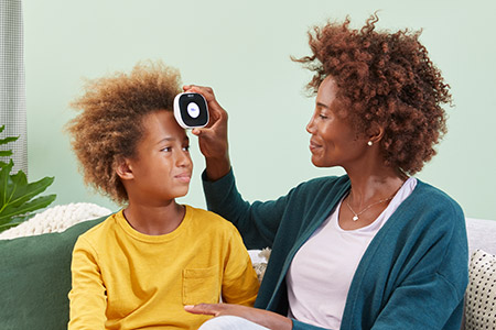
Image Callout (CTA)
The heading has a 50 character limit and a 200 character limit for the copy. Image recommendation is 496 x 496px (for square images) or 747 x 496px (for rectangle images). Images scale to fit the width of the 50/50 layout.
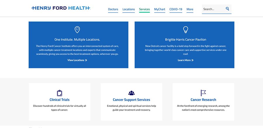
Call-to-action buttons or CTA buttons generally appear higher up on the page and should link to the main actions that would help support the patient's next step in their journey. Most often these buttons link to a filtered list of doctors or locations that offer that particular service, but the button link destination is flexible. Two CTA buttons can be added to a page at a time and can also include icons for each button. See the following CTA button examples:
.

Accordions or tabs can be placed on any page template to house multiple sections of content related to that page topic. Accordions will appear collapsed on default and the user can click on each title to expand (and then collapse) each section. Tabs will display the first panel on default and the user can click on each tab to bring that specific panel forward. A title should be included for each accordion or tab. The max amount of sections for each accordion or tab component is 10. Multiple accordions or tabs can be used throughout the page and can feature images or other styles available from the website. See the following examples.
The recommended size for images within the accordions is 450x300 pixels.
 Lorem ipsum dolor sit amet, internal link consectetur adipiscing elit. Aenean bold text (strong) euismod bibendum laoreet. Proin external link gravida dolor italic text (em) sit amet lacus accumsan et viverra justo commodo. Lorem ipsum dolor sit amet, consectetur adipiscing elit link to file.
Lorem ipsum dolor sit amet, consectetur adipiscing elit. Aenean euismod bibendum laoreet. Proin gravida dolor sit amet lacus accumsan et viverra justo commodo. Lorem ipsum dolor sit amet, consectetur adipiscing elit.
internal link consectetur adipiscing elit. Aenean bold text (strong) euismod bibendum laoreet. Proin external link gravida dolor italic text (em) sit amet lacus accumsan et viverra justo commodo. Lorem ipsum dolor sit amet, consectetur adipiscing elit link to file.
Lorem ipsum dolor sit amet, consectetur adipiscing elit. Aenean euismod bibendum laoreet. Proin gravida dolor sit amet lacus accumsan et viverra justo commodo. Lorem ipsum dolor sit amet, consectetur adipiscing elit.
The recommended size for images within the tabs is 450x300 pixels.
 Lorem ipsum dolor sit amet, internal link consectetur adipiscing elit. Aenean bold text (strong) euismod bibendum laoreet. Proin external link gravida dolor italic text (em) sit amet lacus accumsan et viverra justo commodo. Lorem ipsum dolor sit amet, consectetur adipiscing elit link to file.
Lorem ipsum dolor sit amet, consectetur adipiscing elit. Aenean euismod bibendum laoreet. Proin gravida dolor sit amet lacus accumsan et viverra justo commodo. Lorem ipsum dolor sit amet, consectetur adipiscing elit.
Lorem ipsum dolor sit amet, internal link consectetur adipiscing elit. Aenean bold text (strong) euismod bibendum laoreet. Proin external link gravida dolor italic text (em) sit amet lacus accumsan et viverra justo commodo. Lorem ipsum dolor sit amet, consectetur adipiscing elit link to file.
Lorem ipsum dolor sit amet, consectetur adipiscing elit. Aenean euismod bibendum laoreet. Proin gravida dolor sit amet lacus accumsan et viverra justo commodo. Lorem ipsum dolor sit amet, consectetur adipiscing elit.
Buttons are available in several colors and configurations. Color and font sizing has been configured to maintain proper WCAG 2.0 level AA contrast requirements. Similar to typography, buttons scale as the view port is reduced (from 1500px and lower) until the base copy reaches 14px (minimum recommended font size). Base button height is 49px. Text will be center aligned on the button and they can be featured with arrows. Buttons will include a hover state when the cursor hovers on or clicks the button.
The phone number CTA should be used to display a main call-to-action or other prominent information for the page. The callout style features a gray background with a small vertical green line on the left. Any style of text, links, or phone numbers can be included. The CTA can be inserted anywhere within the page content as many times as needed. There is no set character count, but the style works best with content that has a few lines of text or less. See the following example:
The pull quote is used for highlighting a small section of text within a paragraph and should be used for things like patient testimonials or physician quotes, etc. The font will appear larger with a gray background behind it. There is no set character count, but the style works best with content that has a few lines of text or less. See the following example:
Below is a sample of icons selected as part of the website design. Icons have been selected to maintain a similar look and feel, displaying in one color with medium-thin lines and simplicity in mind. Icons will generally display in 1 of 3 colors: dark blue (Hex: #003E74) for general decorative usage, light blue (Hex: #0078C9) if used as part of a link, button or similar CTA, or white (Hex: #FFFFFF) if used on a dark background.
Line weight of icons may vary slightly depending on the placement and usage of the icon (ex: a smaller icon may have slightly thicker line weight; a while icon on a darker background may have slightly thinner line weight).
For additional icon options, refer to the Font Awesome website.
Tables and columns are used to display and order information into various lists or columns. Using these styles can help to improve the layout of the page to condense the information together in a group. Tables and columns are ideal for listing out services, price information, or outcome statistics. See the following examples:
Phone: (313) 982-8100
Monday & Tuesday
8 a.m. to 8 p.m.
Wednesday, Thursday & Friday
8 a.m. to 5 p.m.
Saturday
8 a.m. to 12 p.m.
Phone: (313) 982-8100
Monday - Friday
8 a.m. to 8 p.m.
Weekends & Holidays
Phone: (313) 982-8323
Fax: (313) 982-8312
Monday & Tuesday
7 a.m. to 7:30 p.m.
Wednesday, Thursday & Friday
7 a.m. to 5 p.m.
Saturday
8 a.m. to 12 p.m.
| Heading Column 1 |
Heading Column 2 |
Heading Column 3 |
Heading Column 4 |
|---|---|---|---|
| Column 1 Row 1 |
Column 2 Row 1 | Column 3 Row 1 | Column 4 Row 1 |
| Column 1 Row 2 | Column 2 Row 2 | Column 3 Row 2 | Column 4 Row 2 |
| Column 1 Row 3 | Column 2 Row 3 | Column 3 Row 3 | Column 4 Row 3 |
| Table Heading 1 | Table Heading 2 |
|---|---|
| Row 1 Item 1 | Row 2 Item 2 |
| Row 2 Item 1 | Row 2 Item 2 |
| Row 3 Item 1 | Row 3 Item 2 |
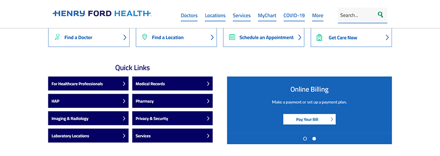
The main call to action with a single button is shown below. It features a heading, description, and a button. To ensure that the callout displays properly across all view ports, character limits have been established for the heading and description. A 40 character limit has been set for the heading, and a 50 character limit has been set for the description, including punctuation.
The CTA can appear at the top or bottom of the page. If there is a hero image on the page, the CTA will appear underneath. See the following image and a live full-width CTA example further down the page.

The main call to action with multiple buttons is shown below. It features a heading and up to three buttons. To ensure that the callout displays properly across all view ports, character limits have been established for the heading and buttons. A 40 character limit has been set for the heading, and a 50 character limit has been set for the button text.
The CTA can appear at the top or bottom of the page. If there is a hero image on the page, the CTA will appear underneath. See the following image and a live full-width CTA example further down the page.

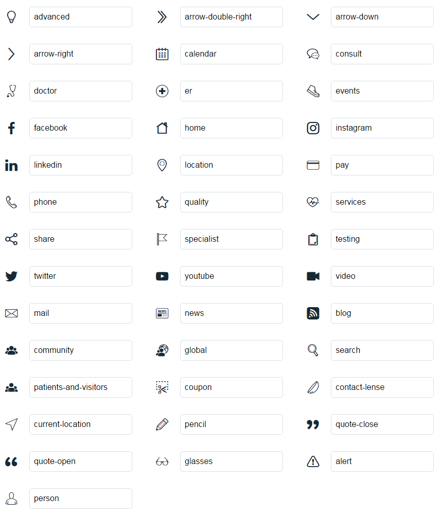
Blue and white text features feature an icon, heading/link, and body copy. To ensure that the callouts display properly across all view ports, character limits have been established for the heading and body copy. Blue text features work best when there are two callouts displayed. White text features work best when there are three callouts displayed. Either one can be used independently or both can be featured together. These callouts appear at the bottom of the page and should feature related content for that section.
A 50 character limit has been set for the heading, and a 150 character limit has been set for the body, including punctuation. See the following images and example blue and white text CTAs further down the page.
The rotating text feature has a heading, body, and a button. This callout can house up to four unique slides and can be rotated manually by clicking on the controls. The rotating text feature can only appear on homepages, such as microsites and regional location (hospital) pages. To ensure that the callout displays properly across all view ports, character limits have been established for the heading and body.
A 50 character limit has been set for the heading, and a 120 character limit has been set for the body. See the following image and example as shown on the henryford.com homepage.
The Show Me section displays news articles, classes and events, blog articles and Instagram posts in a callout feature. The Show Me results can be filtered by keyword, such as service line or location, and will dynamically feed the latest posts from that particular category in a teaser format which may also include an image. Any of the Show Me categories can be included or omitted. The user can toggle between each Show Me link to see four results from each category and can then click on the specific feature link or "View All" link to find all results from that category. See the Show Me example at the bottom of the page.
Flexible CTAs can be featured with or without an image and can be displayed inline, right or left aligned, or as a full width CTA. Character count recommendations: 50 characters for the heading, 120 characters for the body, 40 characters for the button/link text. However, since these are flexible, more text characters can be added, if needed. These CTA features are ideal for featuring content that is directly related to the body copy that is it displayed within. See the following examples for inline and full width CTA options.
Images should be sized 346 x 158px for the inline CTA.
Lorem ipsum dolor sit amet, consectetur adipiscing elit. Nam at nunc orci. Etiam blandit, leo quis vestibulum laoreet, lectus justo rhoncus velit, nec sollicitudin mi dolor a nibh. Integer sed orci augue. Cras euismod, neque a consequat scelerisque, quam nulla aliquet arcu, vel dignissim dolor risus ut odio. Duis in ante cursus, tempor libero a, aliquet lorem. Ut porttitor odio orci, sit amet sodales lacus ultrices tristique. Integer consectetur nunc a molestie faucibus. Duis in diam scelerisque, aliquam nulla eu, dignissim nibh. Vivamus porttitor sem ante, at condimentum lectus ultrices eget. Nunc hendrerit ante quam, non ultrices neque venenatis eget.
Praesent eu risus nec ante porttitor euismod vel in nisi. Maecenas velit dolor, accumsan vitae nibh laoreet, pretium lobortis augue. Praesent ac lacus non enim venenatis mattis. Aliquam iaculis metus dictum, vulputate libero condimentum, placerat diam. Nullam accumsan odio et ultricies convallis. Pellentesque non quam vel ante dictum venenatis in vitae augue. Curabitur vitae malesuada ante.
Interdum et malesuada fames ac ante ipsum primis in faucibus. Fusce ac vulputate neque. Aenean rhoncus est eget scelerisque lacinia. Ut mollis nulla sit amet eros dignissim, a faucibus felis rhoncus. In non diam sed diam tristique venenatis. Quisque ultrices erat urna, in lobortis tortor vehicula et. In at rhoncus metus. Proin cursus mi arcu. Donec ornare, lacus malesuada gravida tempor, nibh libero sollicitudin risus, sed volutpat sem magna in nisi. Nulla feugiat feugiat sodales.
In euismod ligula at sem faucibus venenatis. Curabitur tristique ac est quis pretium. Integer tincidunt velit ac pellentesque pretium. Suspendisse suscipit metus ligula, quis faucibus mauris luctus non. Quisque faucibus purus eu arcu tempor, sit amet lobortis lectus convallis. Vestibulum sed sem nec lacus gravida venenatis et blandit mauris. Nulla elementum felis eu metus pulvinar, nec gravida risus cursus. Sed interdum sagittis nibh nec pharetra. Pellentesque ac nisi non nunc sodales consectetur.
Images should be sized 450 x 300px for the full width CTA.
The heading has a 50 character limit and a 200 character limit for the copy. Image recommendation is 496 x 496px (for square images) or 747 x 496px (for rectangle images). Images scale to fit the width of the 50/50 layout.
We use cookies to improve your website experience. By using this site, you agree to our Terms of Use. Read our Internet Privacy Statement to learn what information we collect and how we use it.